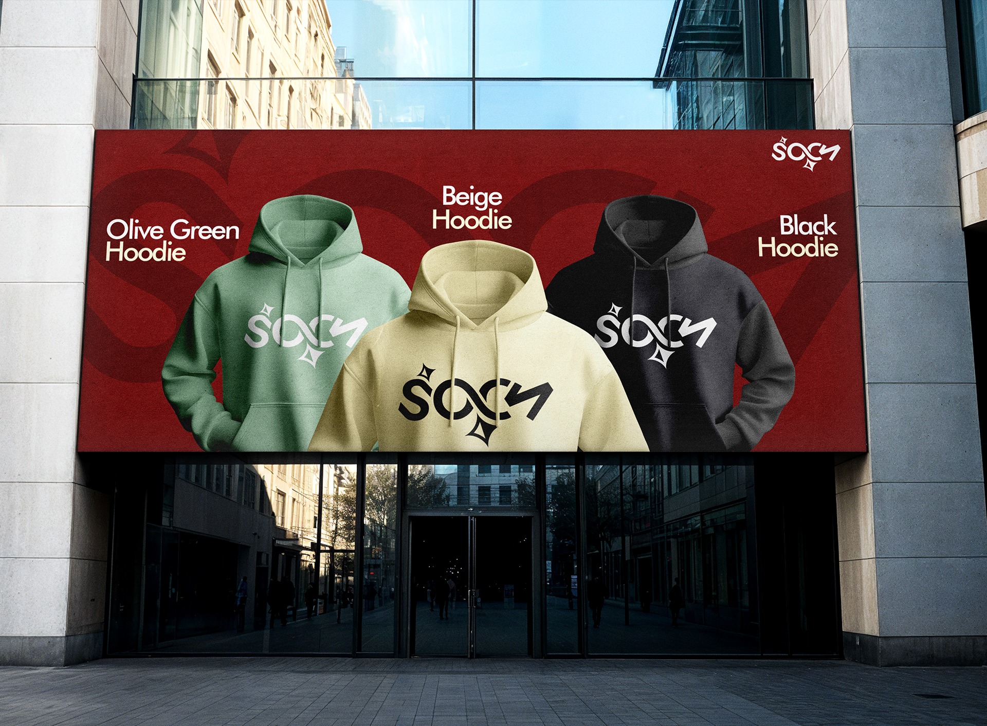
Sochh
My post content
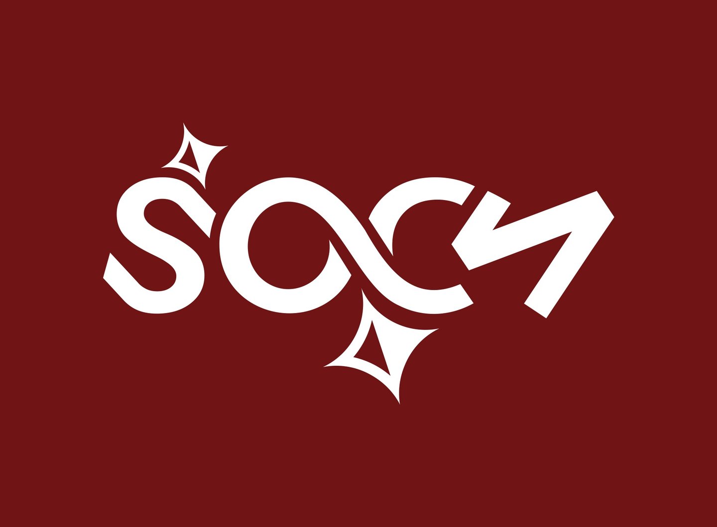

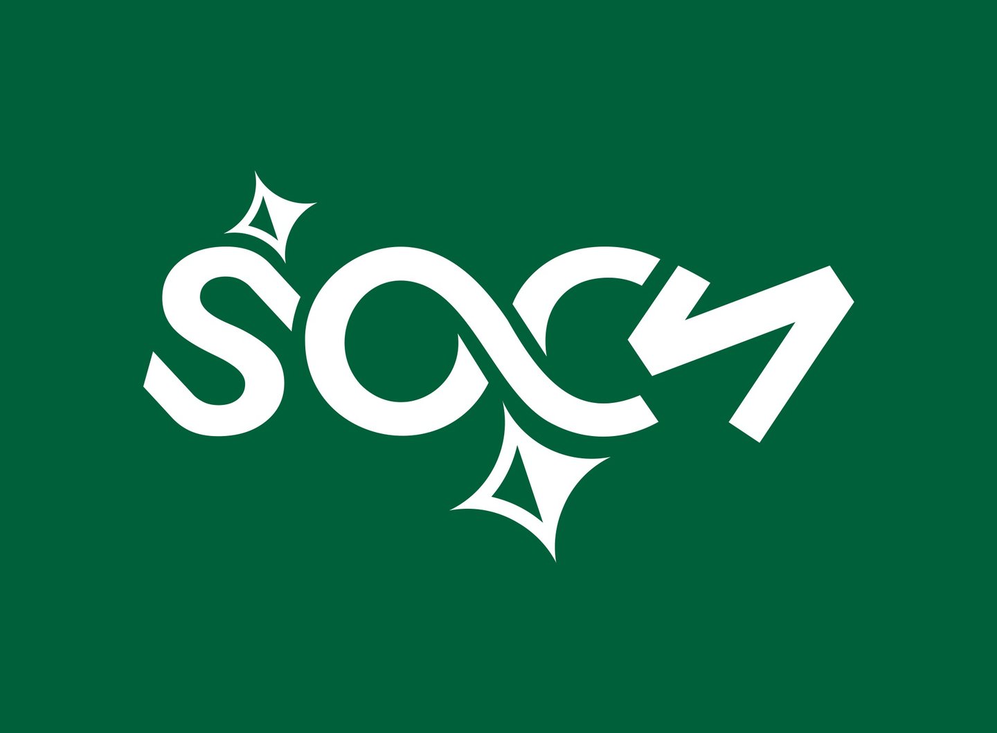
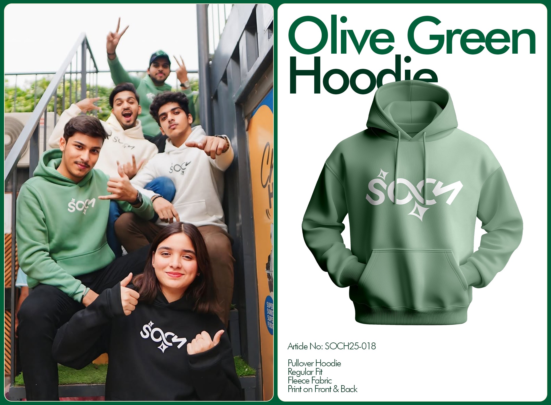
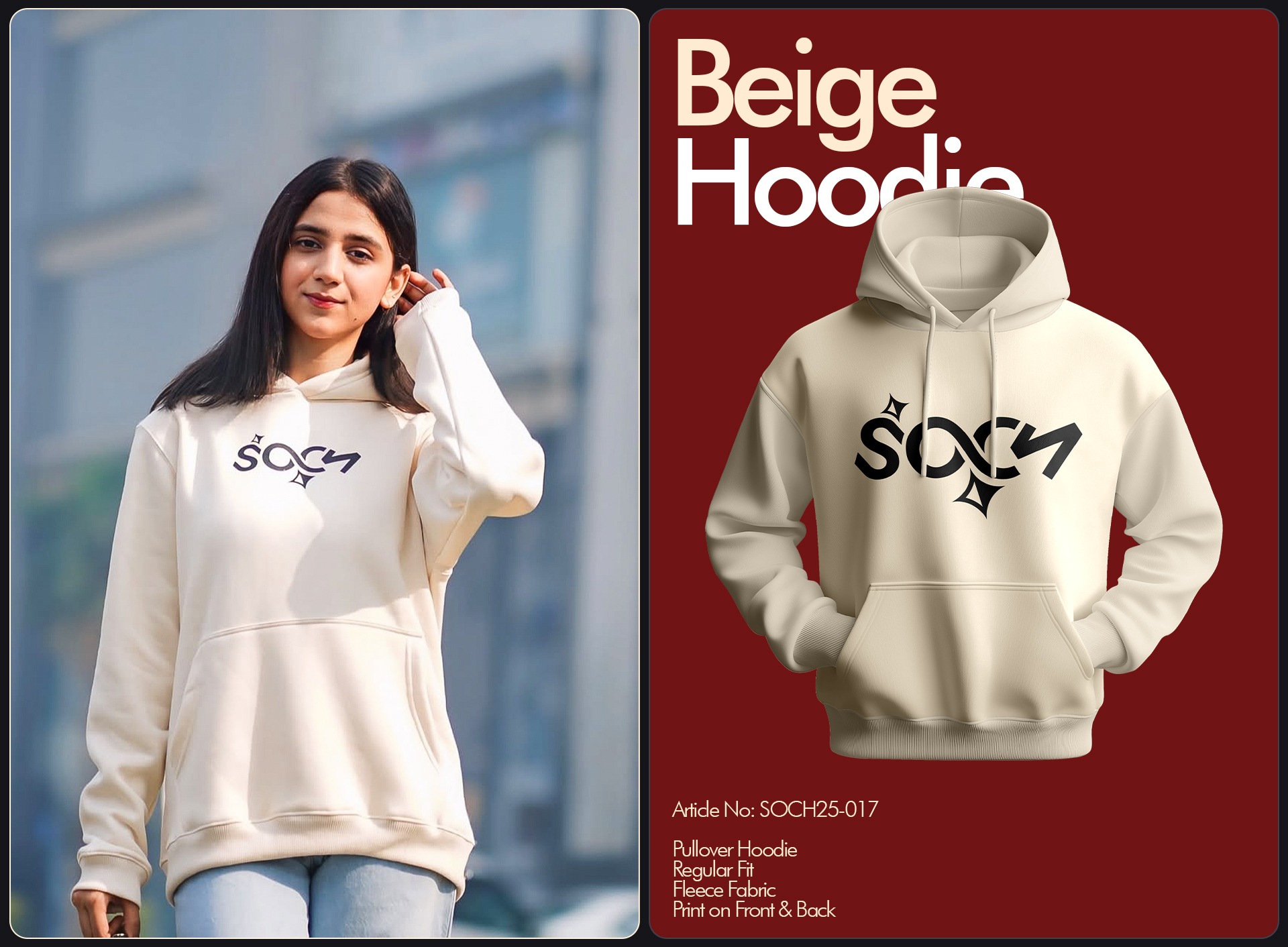
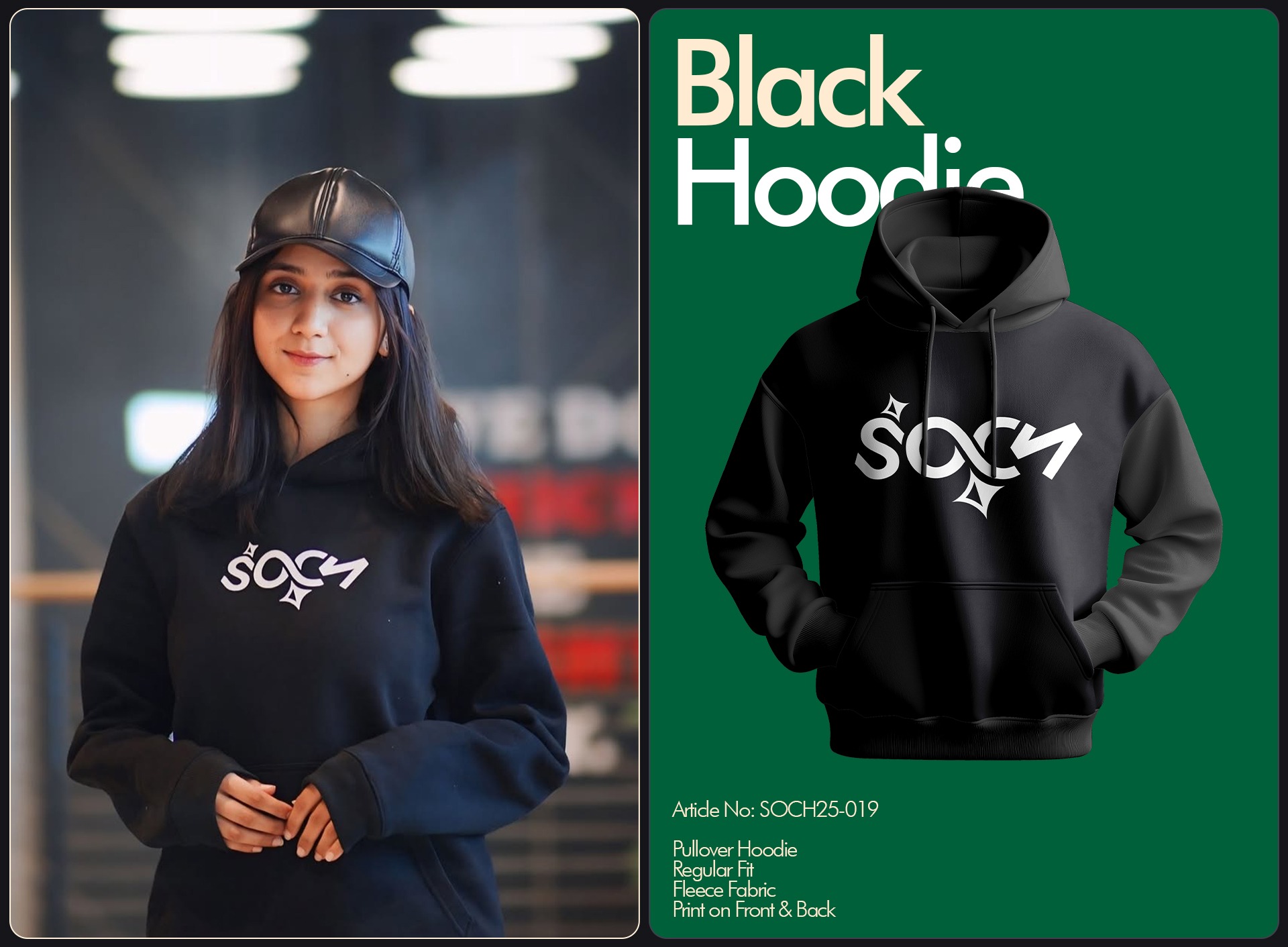
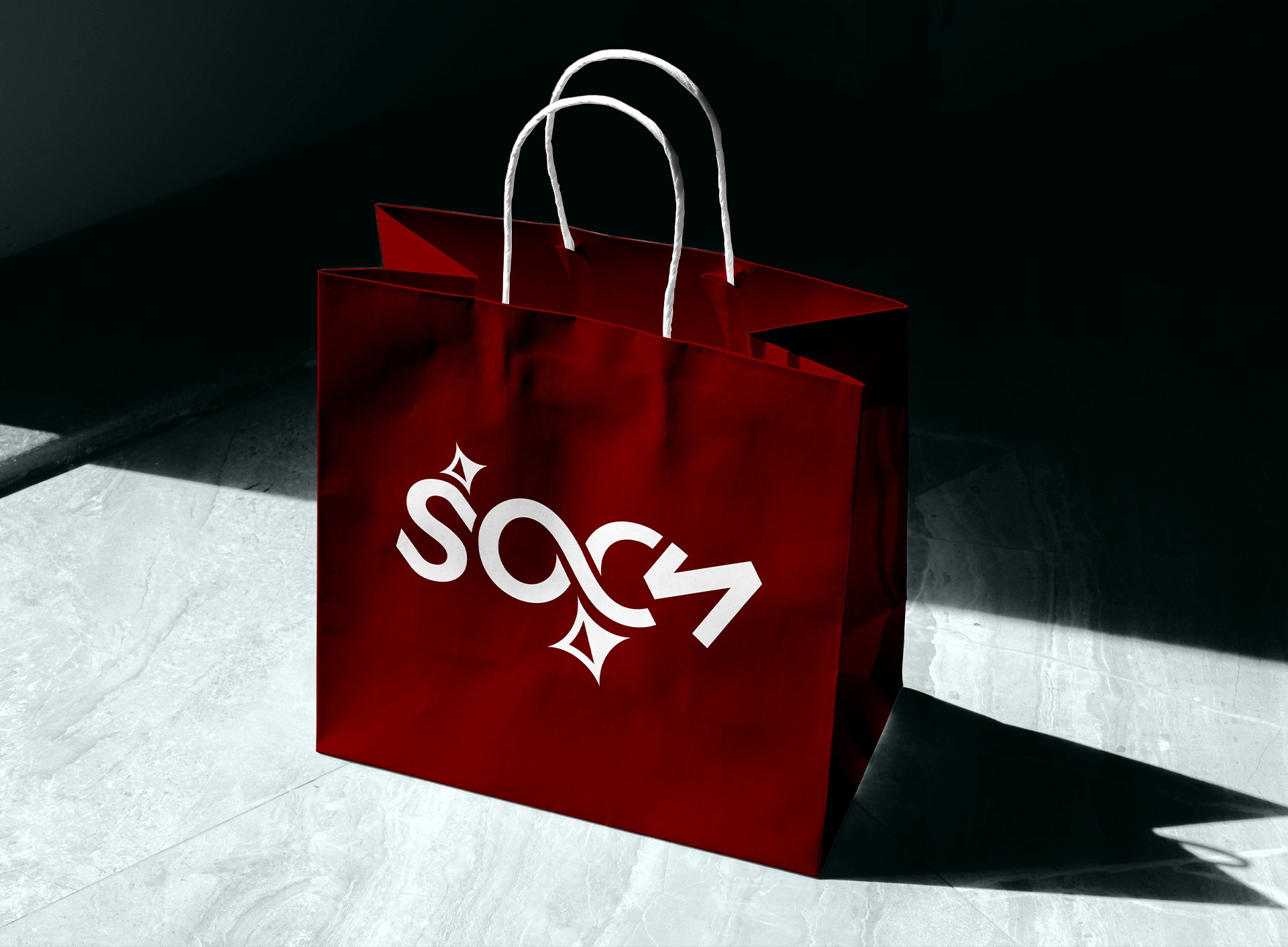


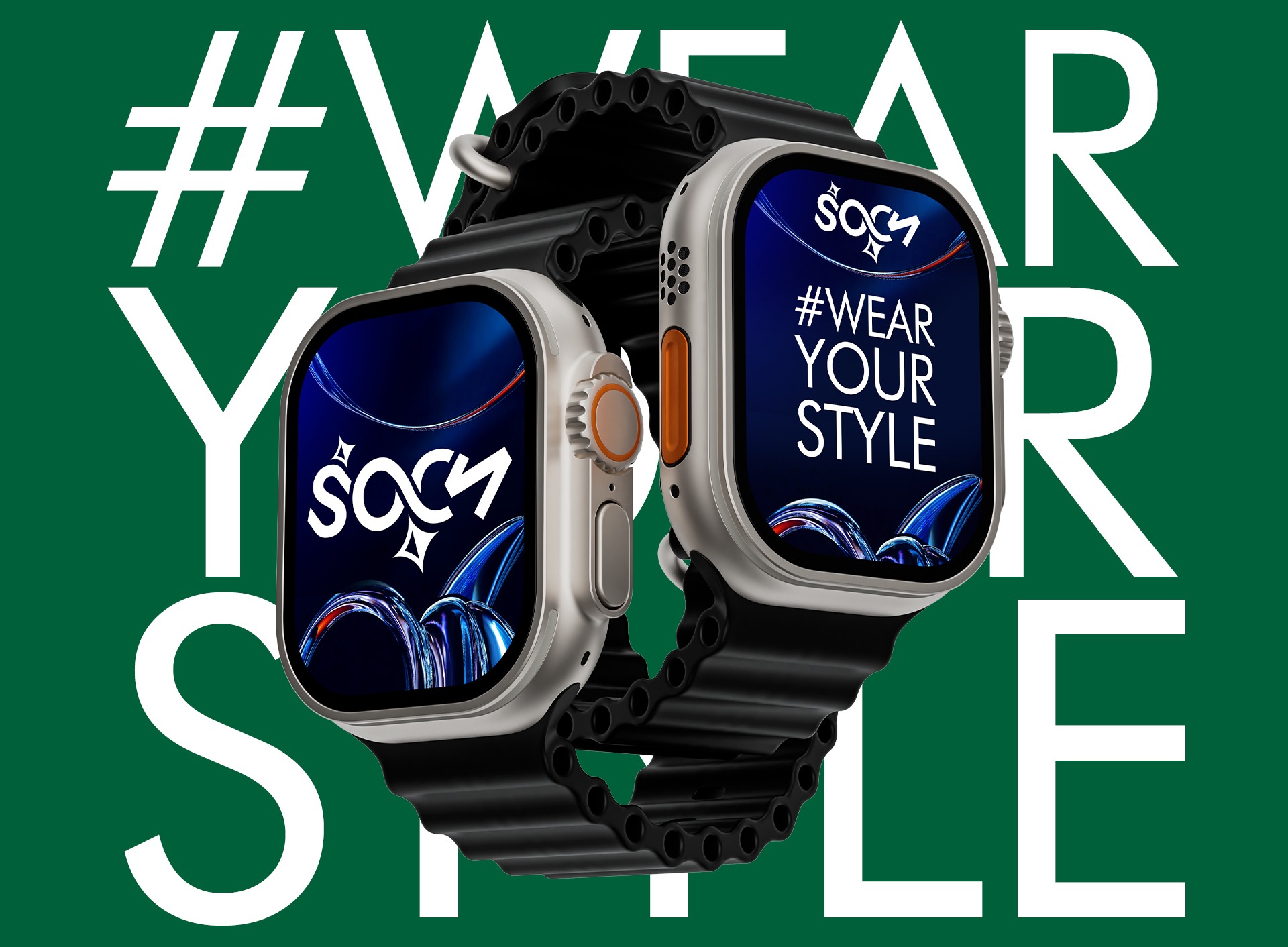
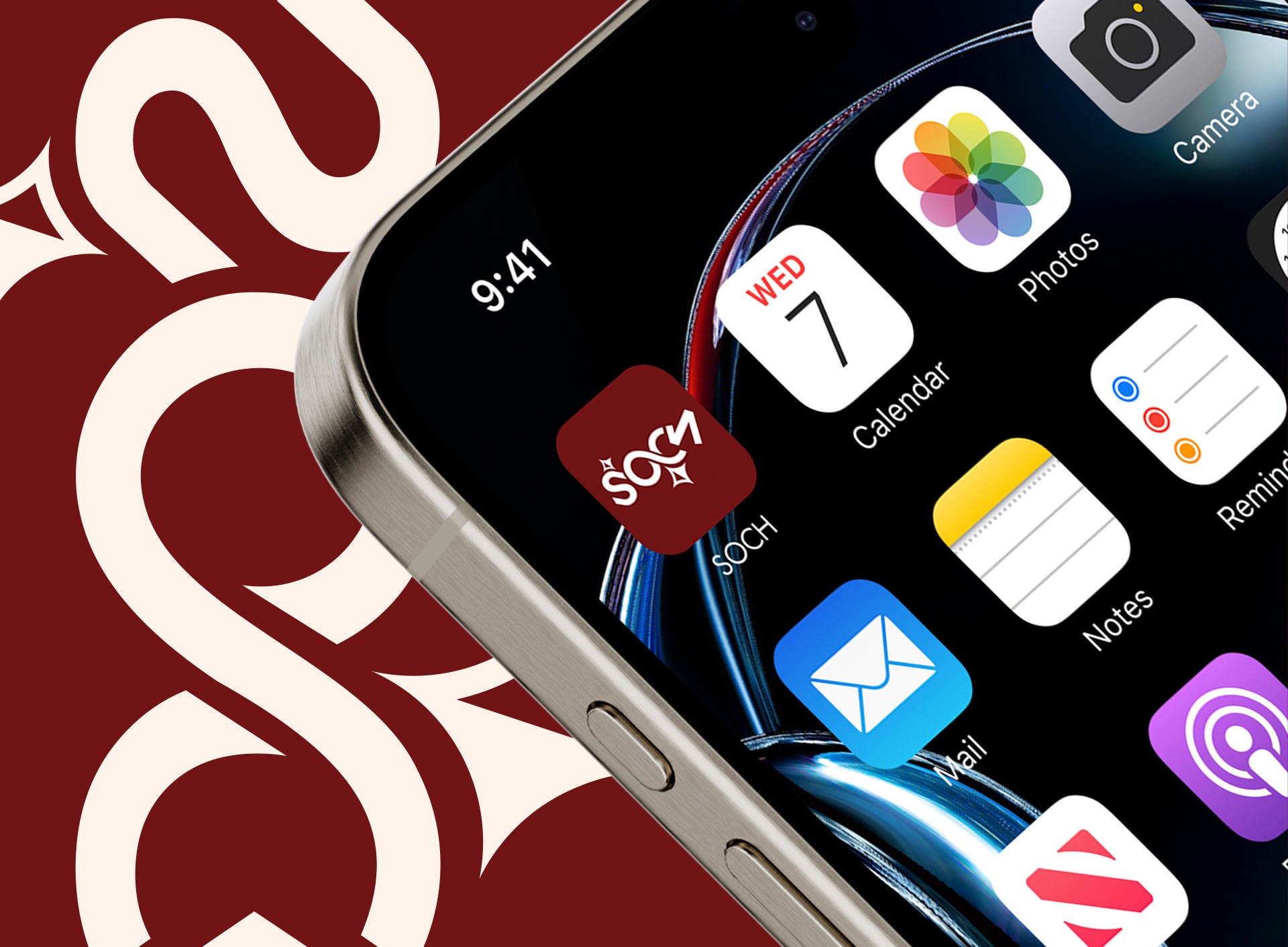
Soch PK is a modern platform with a focus on bold ideas and cultural depth. The brand needed a logo that balanced heritage and modernity, reflecting strong values while feeling current and versatile.
Workflow & Process
We began with research into cultural design cues and color psychology. Maroon was chosen to symbolize strength, passion, and rootedness, while royal green represented prestige, growth, and trust. From there, we explored multiple geometric and typographic logo directions, refining the design to strike a balance between boldness and clarity.
Challenges
The main challenge was finding the right balance honoring cultural richness without making the identity feel dated, and using strong colors without overwhelming the design.
Turnaround
The full project was completed in 8–10 days, including research, drafts, refinements, and delivery.
The Final Outcome
Client Testimonial
★★★★★
Really impressed with the way the brand identity turned out. Clean, bold, and exactly what we had in mind.
I would definitely recommend it for anyone looking to bring their brand to life.


Ali Ahmed Rao
C.E.O -Soch
